
Building visual systems, not just visuals
A strong visual identity is useful. A visual system is more powerful.
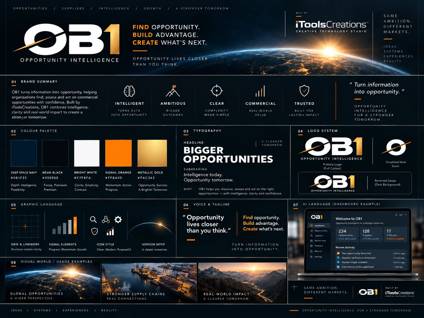
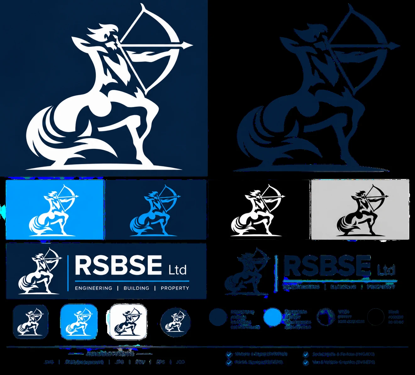
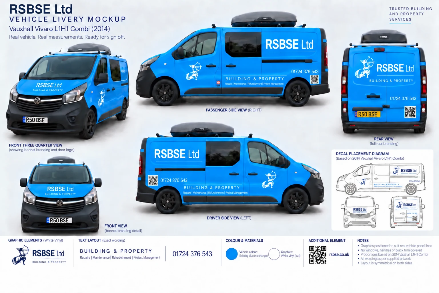
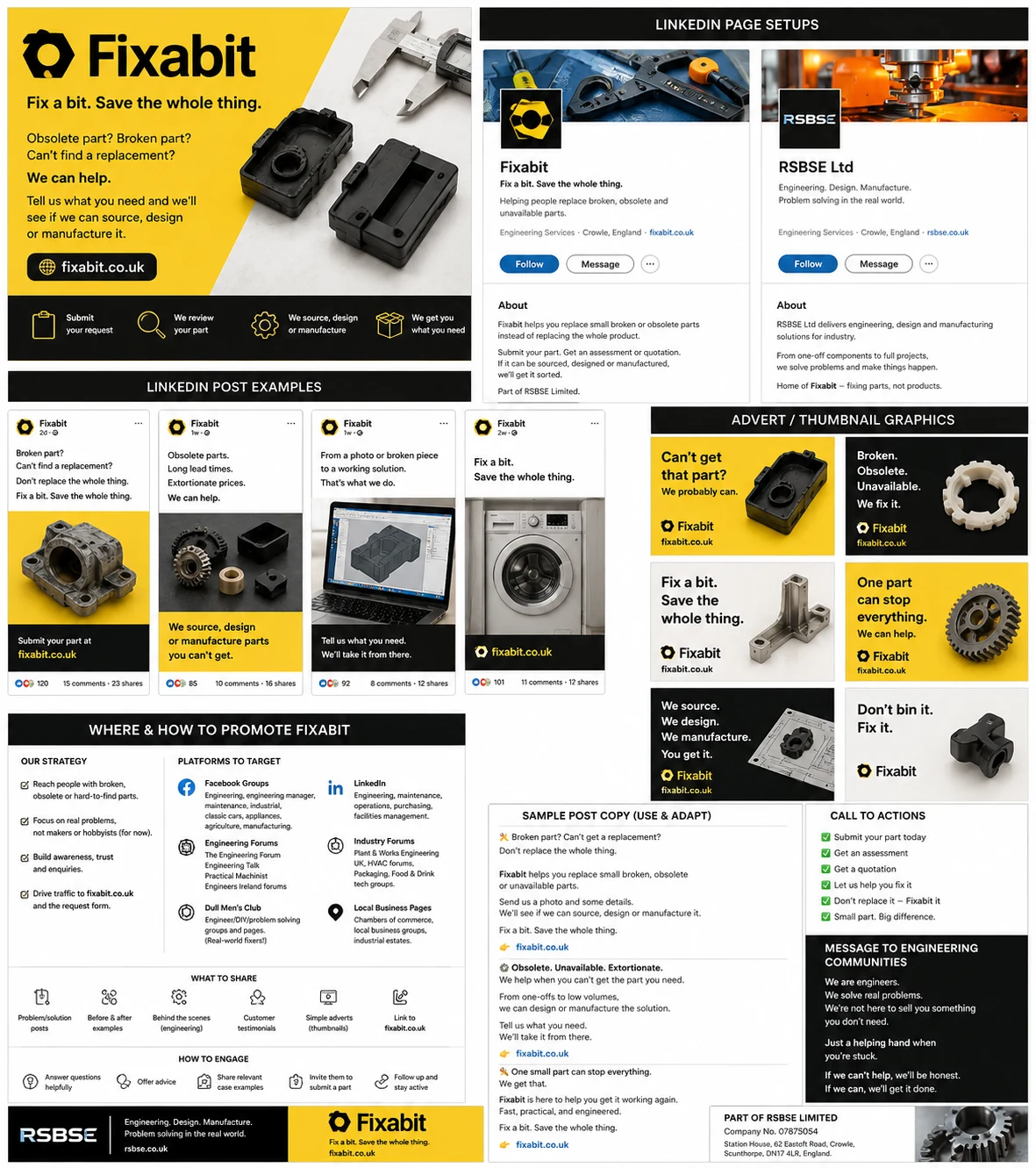
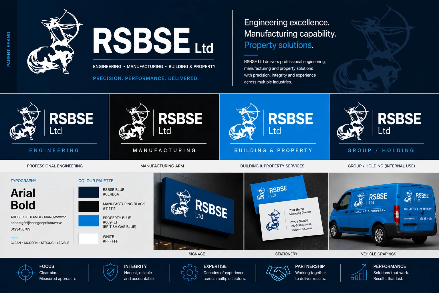
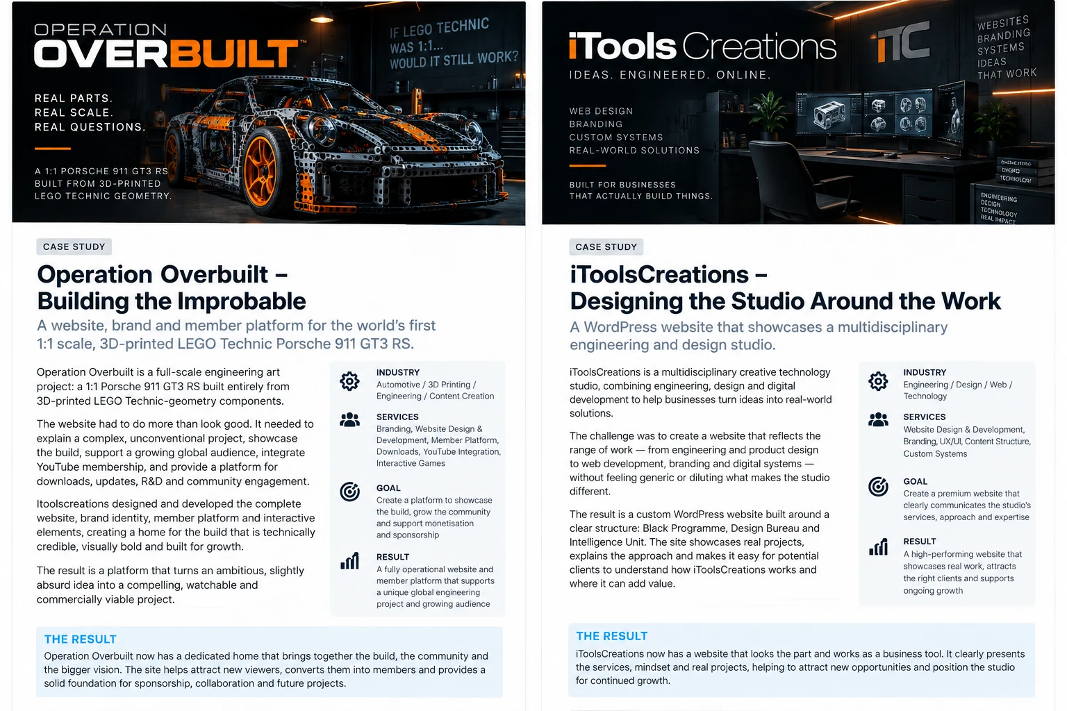
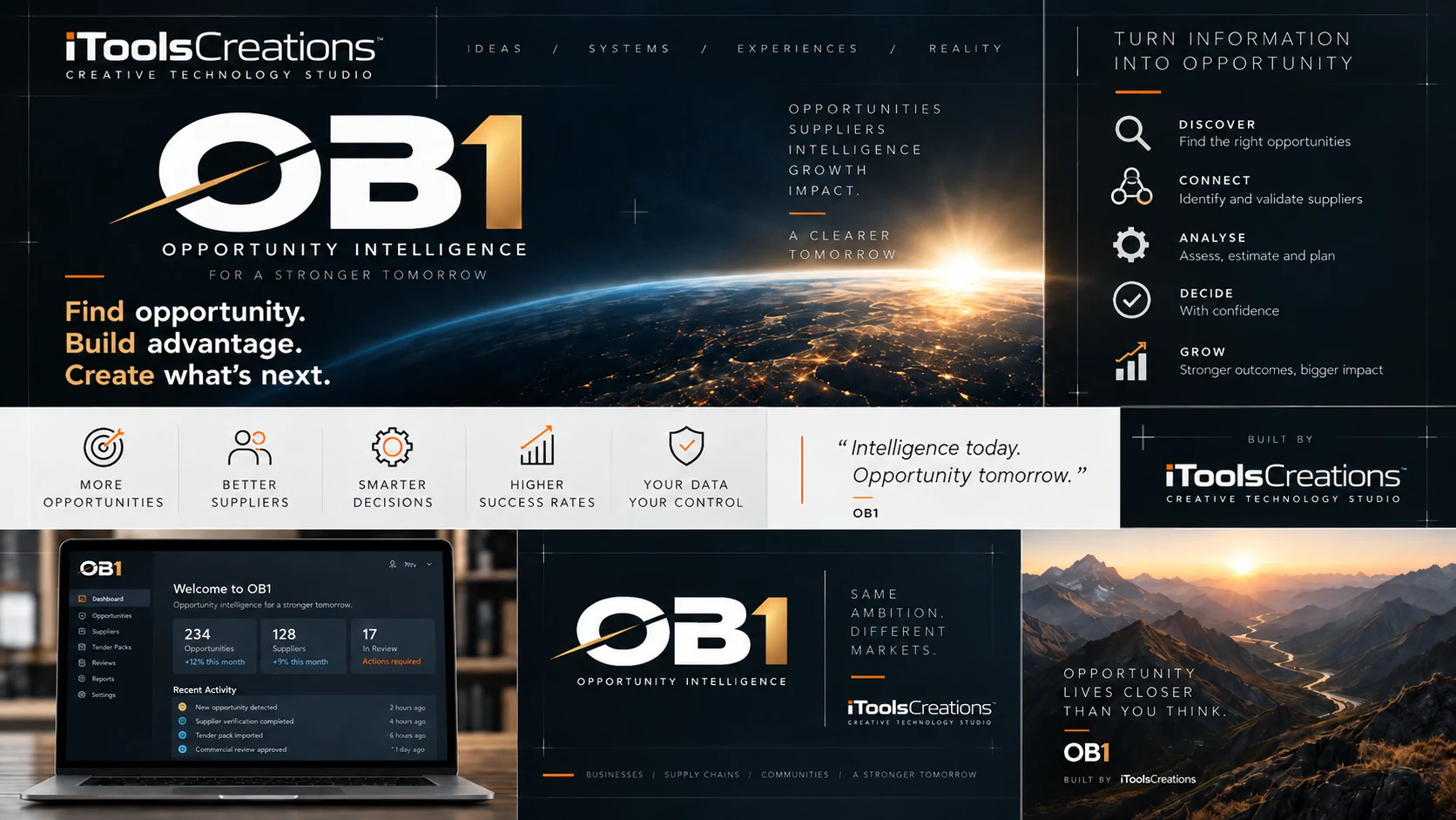
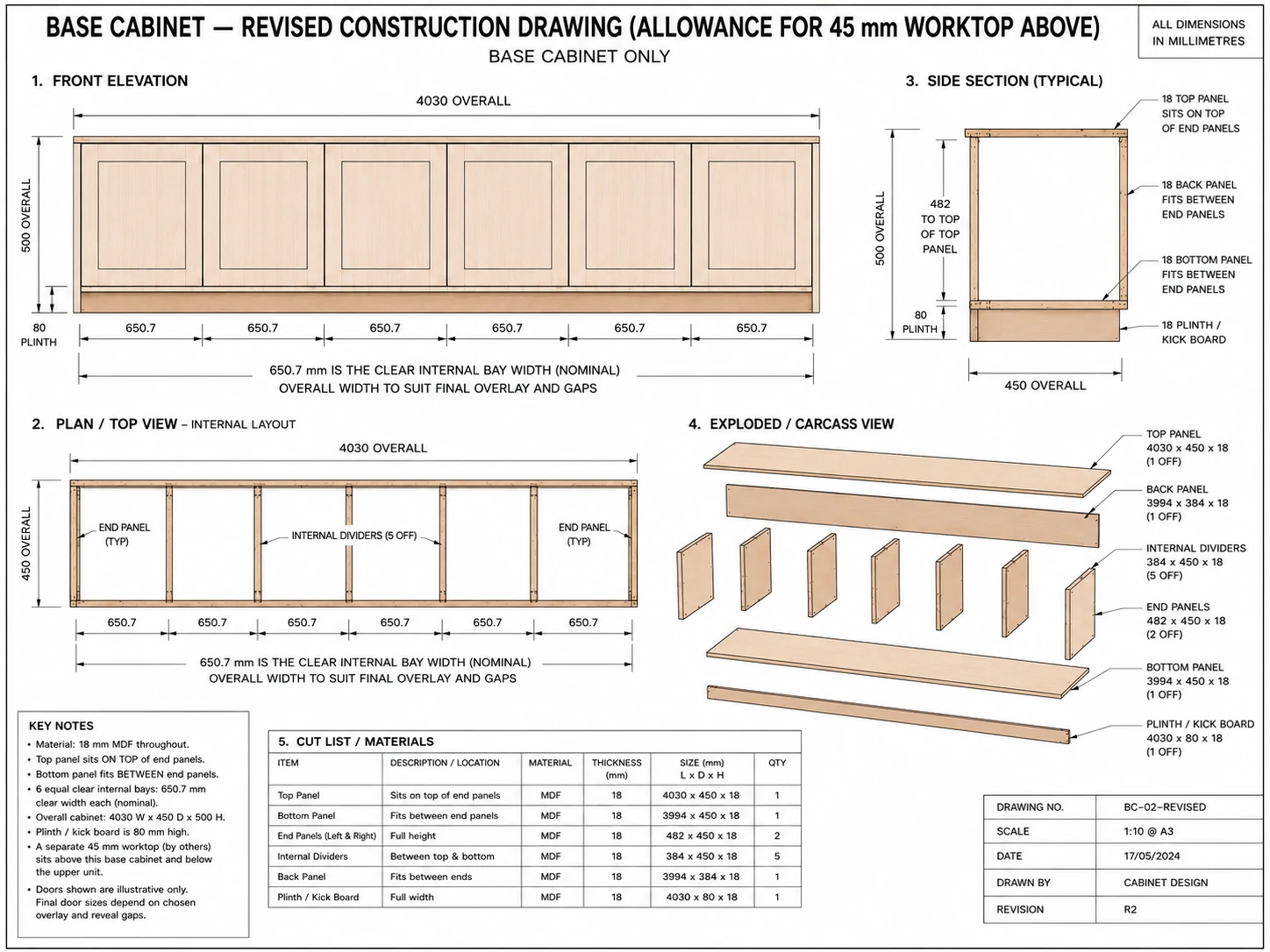
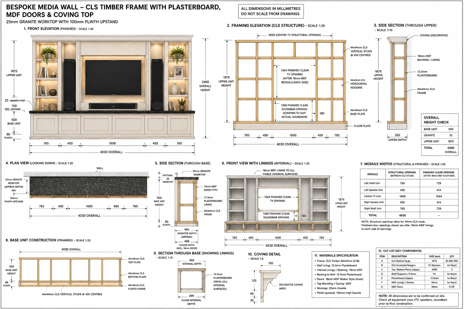
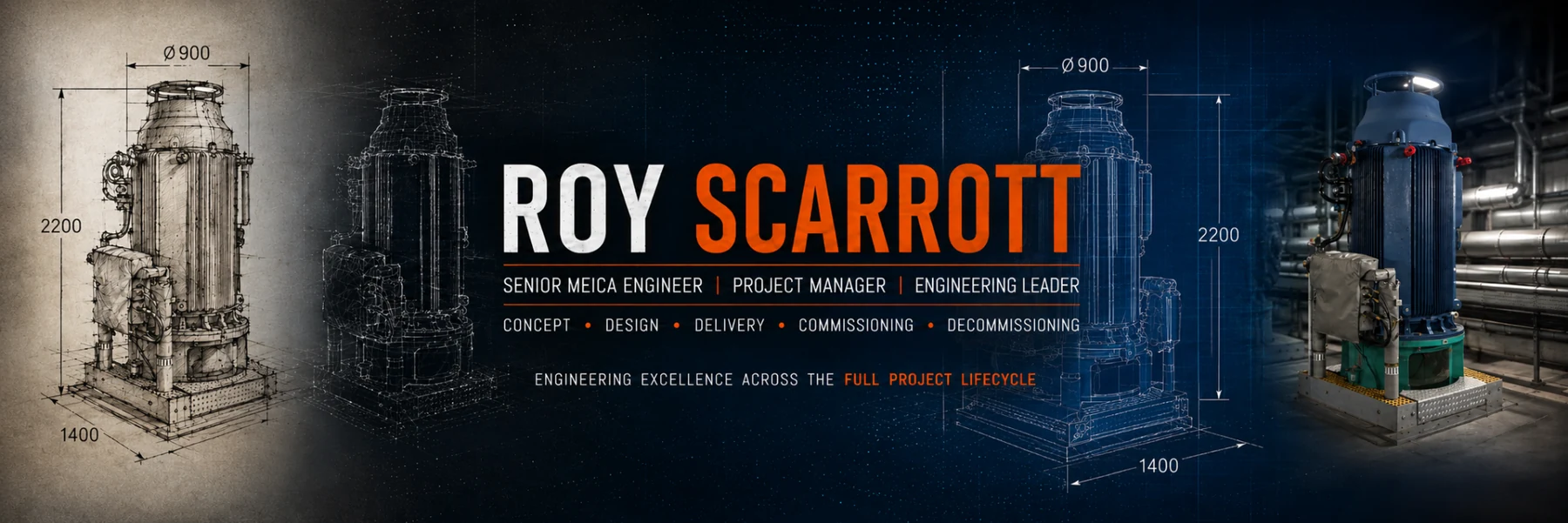
Visual Systems is an ongoing iToolsCreations Lab exploration into how a single creative language can stretch across multiple formats, platforms and audience touchpoints without losing clarity, energy or recognition.
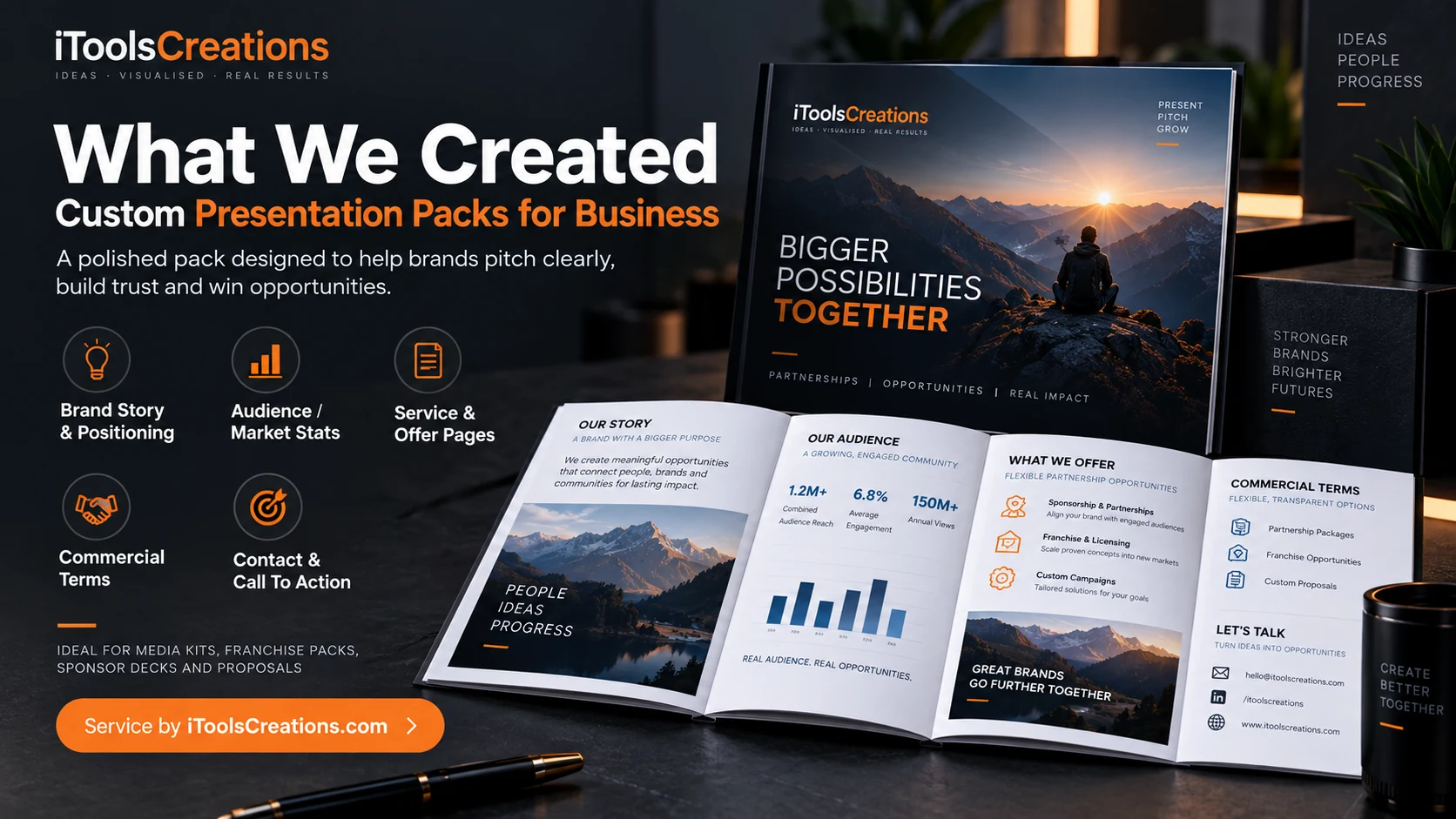
The work is not only about making something look good. It is about building a framework that can support websites, media content, motion assets, interactive experiences, merchandise, campaign visuals and evolving digital products as part of one connected ecosystem.
From single artwork to a connected visual world
Many projects start with a logo and a few headline graphics. The challenge begins when that identity has to live across very different environments.
A poster needs one type of impact. A YouTube thumbnail needs another. A website banner behaves differently again. Merchandise has different constraints from a landing page, a game interface or a campaign asset.
Visual Systems explores how those pieces can be designed as part of one structure, so each asset can do its own job while still clearly belonging to the same world.
Operation Overbuilt as a visual ecosystem
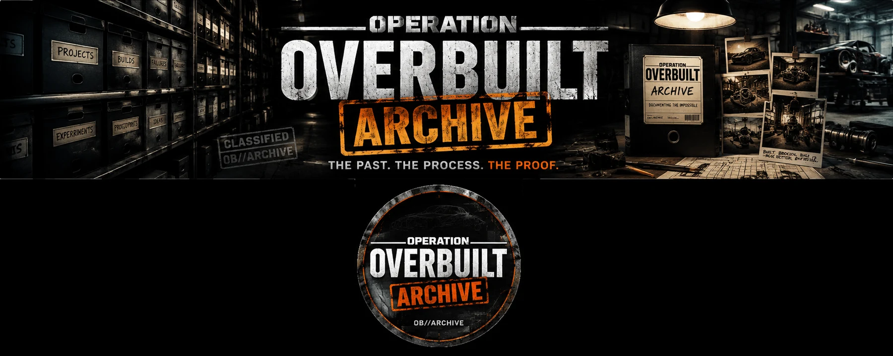
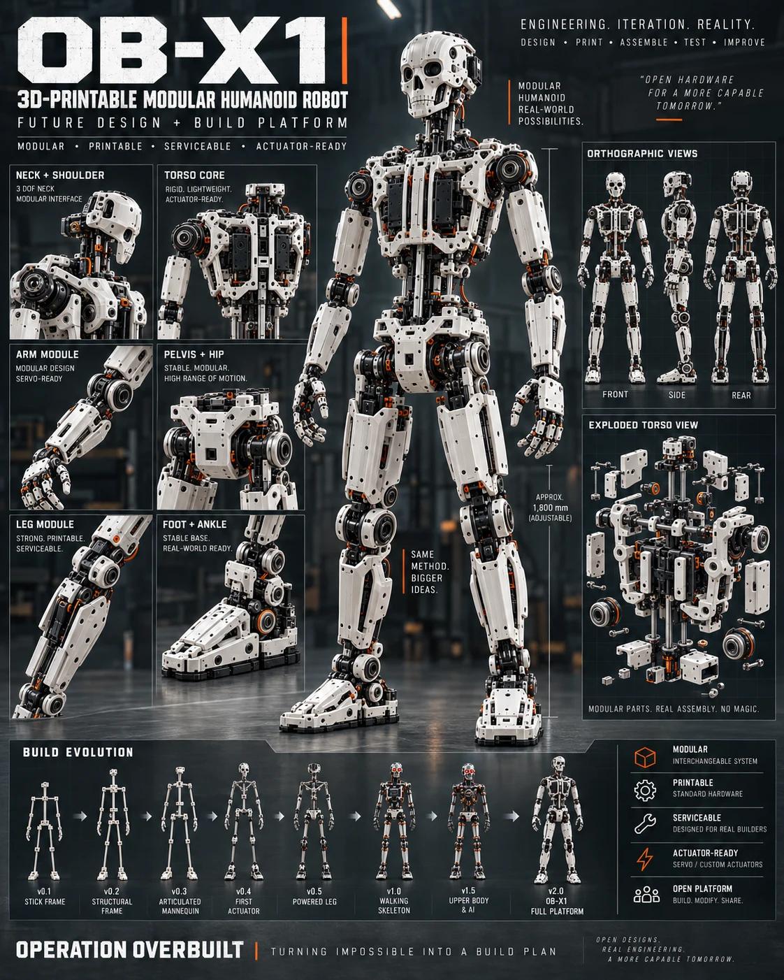
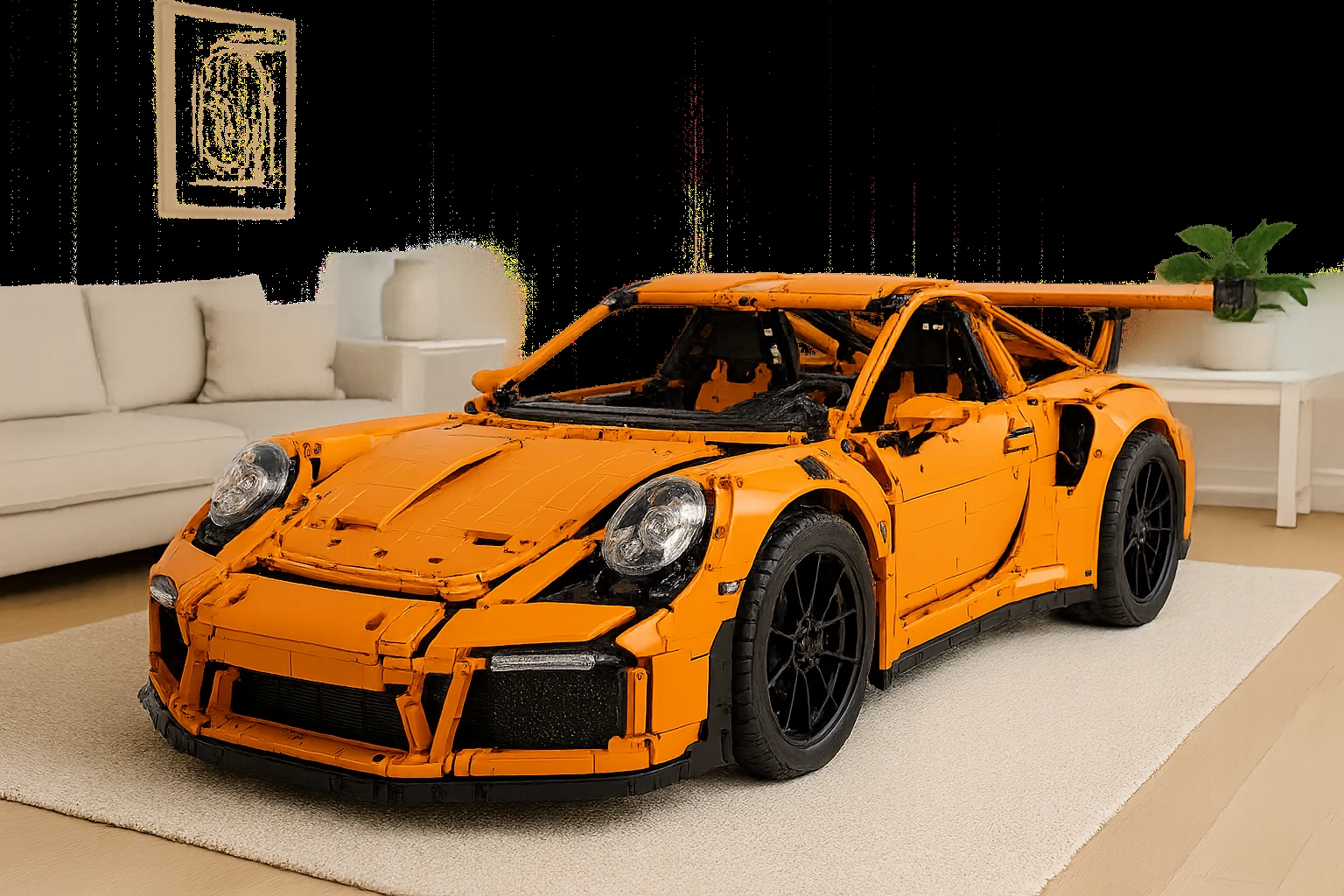
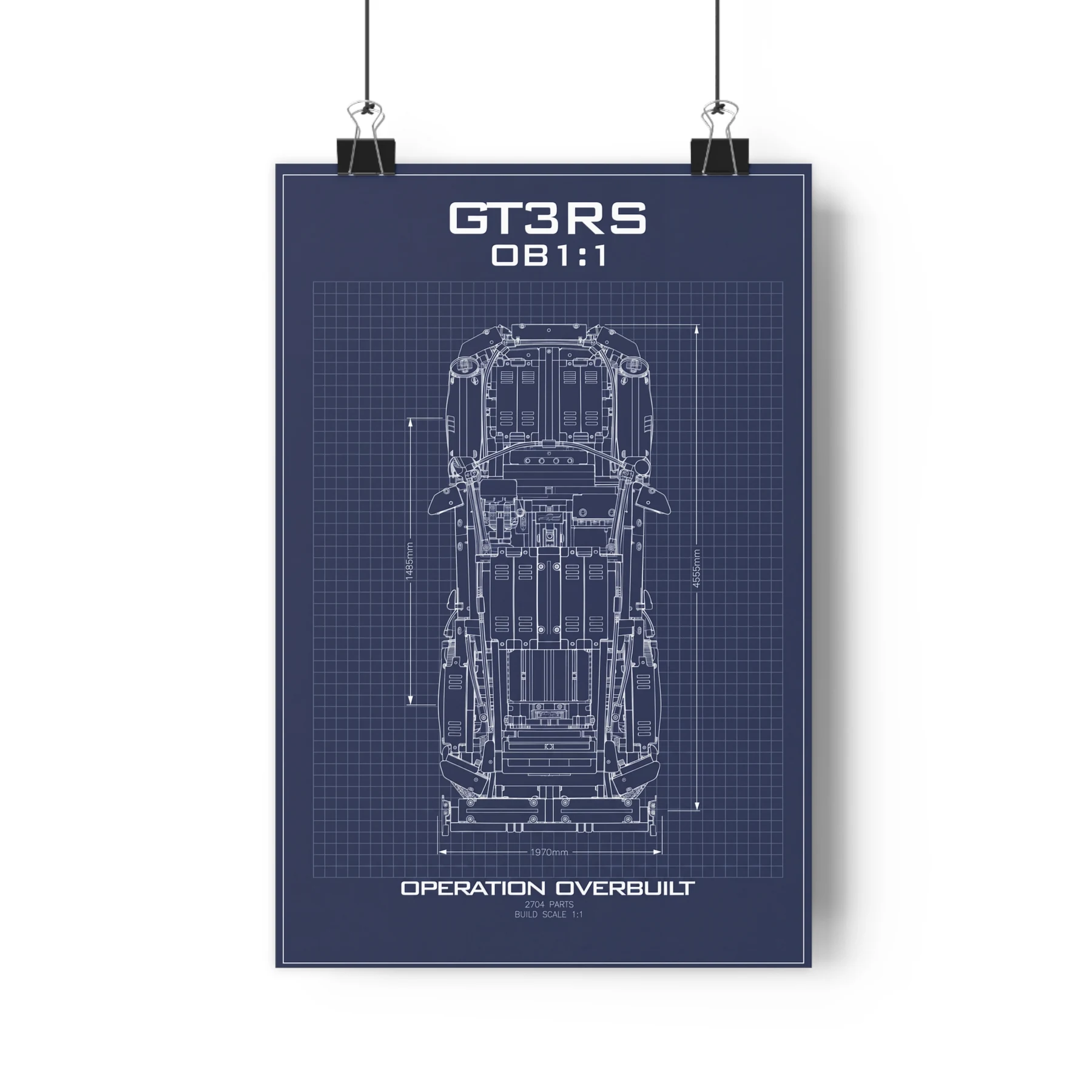
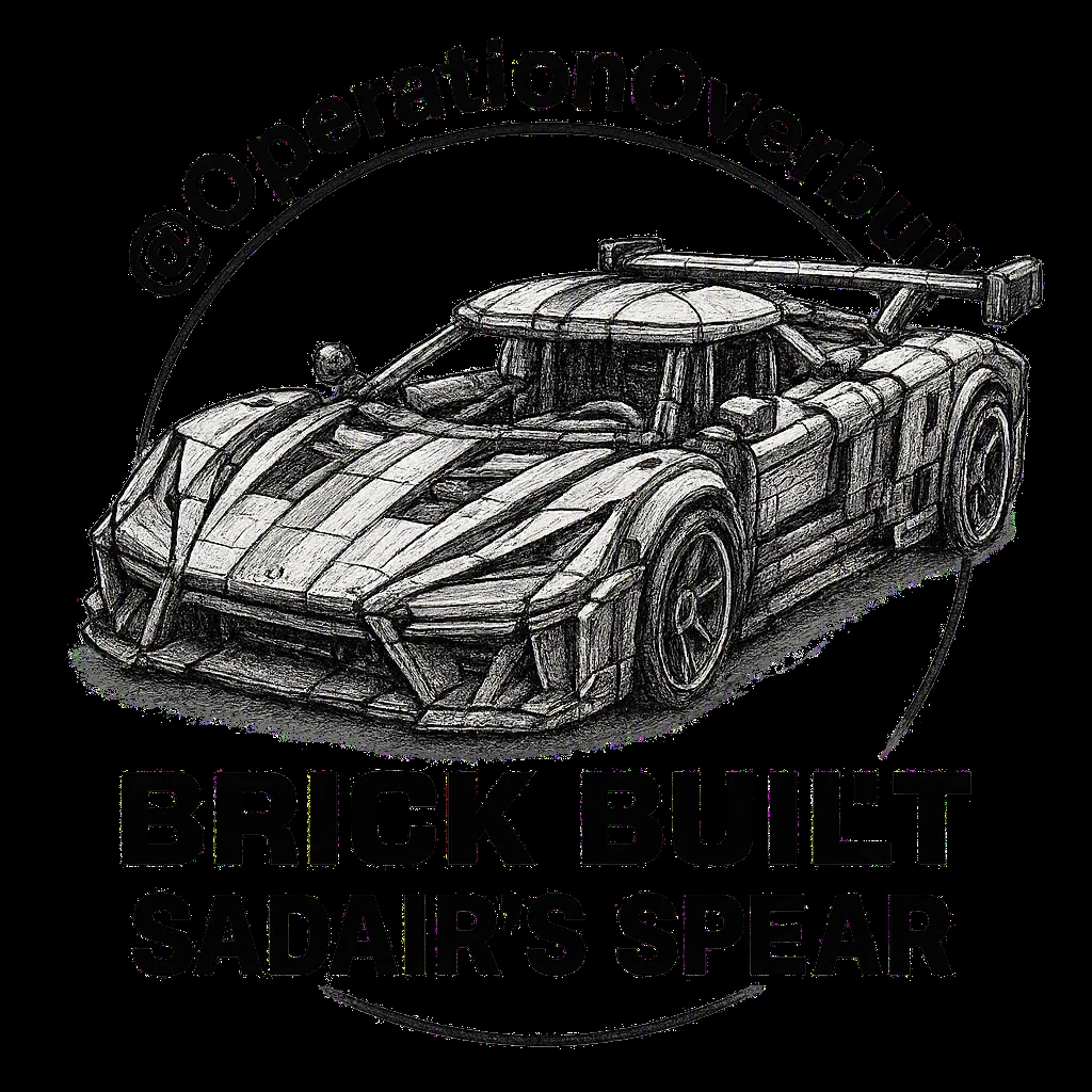
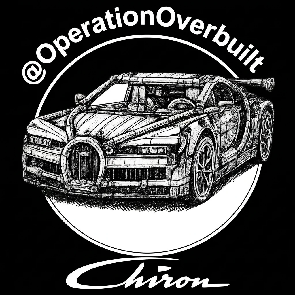
Operation Overbuilt is one of the clearest examples. It is not simply a project with a website. It includes operationoverbuilt.co.uk, a growing YouTube and media presence, mini games, posters, merchandise concepts, promotional graphics and a wider library of visual material supporting the engineering programme.
Each output has different demands, but the project still needs to feel recognisable wherever somebody encounters it. The challenge is not rigid consistency. It is creating a visual system strong enough to survive different formats without becoming repetitive.
Designing for media and attention
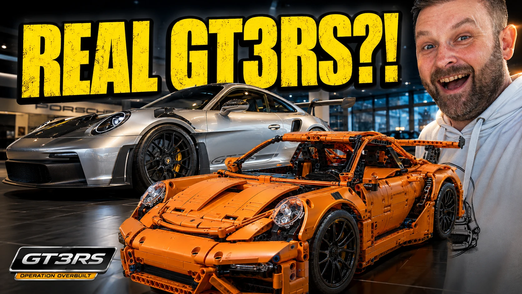
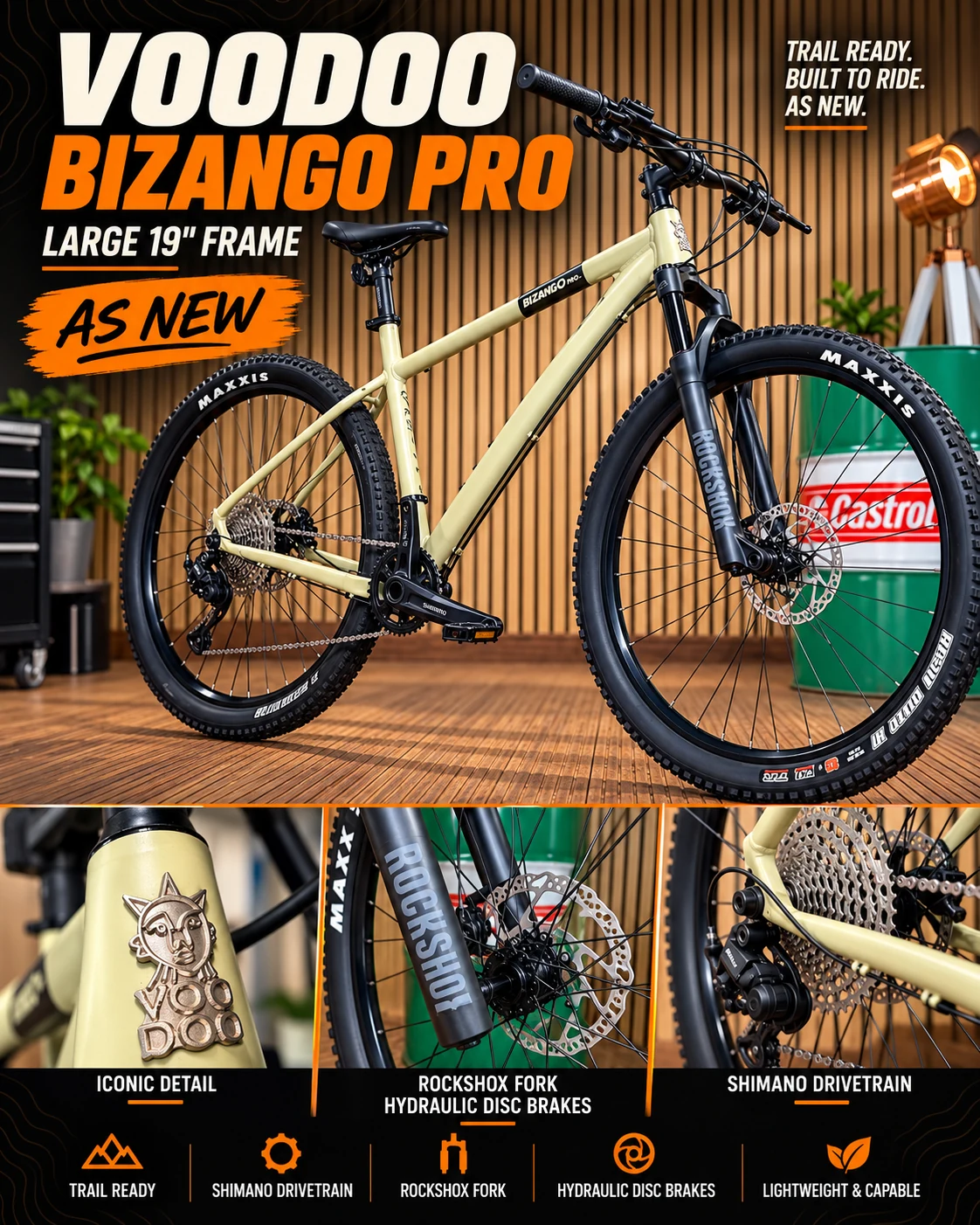
Media assets need to communicate quickly. YouTube thumbnails, channel graphics, title cards, campaign visuals and social content all operate in crowded environments where the visual hierarchy has to work immediately.
This part of the Lab explores how typography, contrast, framing, lighting, recurring motifs and composition can create assets that feel cinematic and project-specific while still working as practical media packaging.
The objective is not generic content styling. It is recognition, clarity and a visual language that supports the story being told.
Websites as visual environments
A website should not feel detached from the media and campaign world around it. In projects such as Operation Overbuilt, the website is part information layer, part brand environment and part interactive platform.
Grid logic, interface styling, image treatment, colour balance, typography and motion all need to carry the same underlying visual logic as the surrounding project, while still respecting what a website needs to do.
The same system can then extend into member areas, downloads, case studies, project archives and other digital experiences without starting again every time.
Mini games and interactive experiments
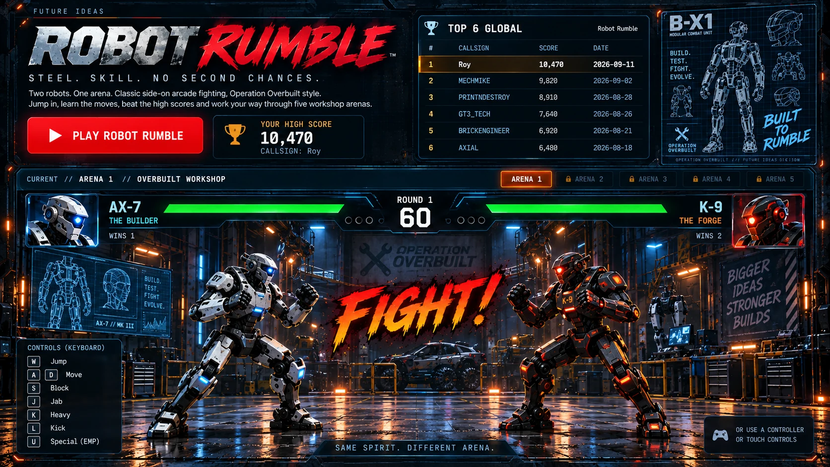
Interactive work introduces another set of rules. A mini game needs to feel playful and immediate, but it still benefits from the wider visual language around it.
The Lab explores how HUD elements, interface components, typography, icons, colour cues and environmental styling can be adapted so games and experimental interfaces feel like natural extensions of the project rather than unrelated novelties.
Posters, merchandise and physical expression
Posters and merchandise are useful tests because they remove the safety net of scrolling, navigation and motion. The design has to work as an object.
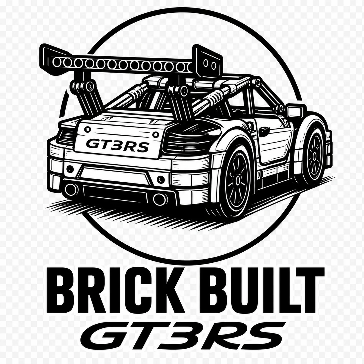
This part of Visual Systems explores graphic reduction, composition, typography, symbolic elements and product-led layouts that can carry digital identity into something people can wear, collect or display.
The strongest pieces do not simply repeat a website banner. They translate the same visual language into a different medium.
Branding is part of it, but not the whole of it
There is an obvious overlap with branding, but the focus here is different. The Brand section deals more directly with identity, positioning and brand creation. Visual Systems is concerned with what happens after that identity starts moving through a larger ecosystem.
It is about how branding behaves when it becomes active, distributed and multi-format.
System thinking over one-off design
One of the core questions behind the Lab is whether a project can generate new material quickly without becoming visually inconsistent.
That means building reusable structures, visual rules and shared logic rather than relying on one-off artwork every time something new is needed.
A good system should make expansion easier, not harder.
What the Lab is really testing
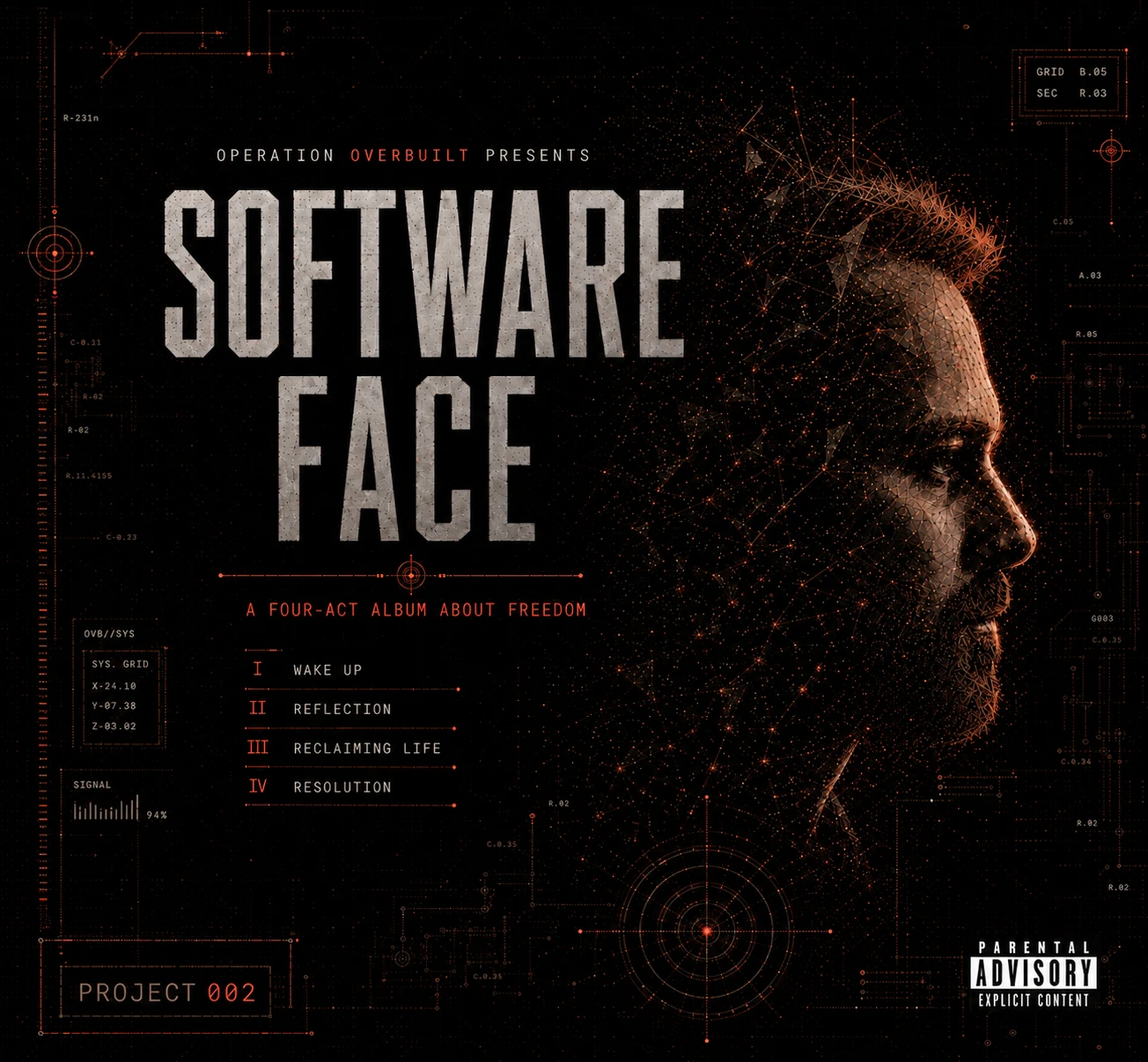
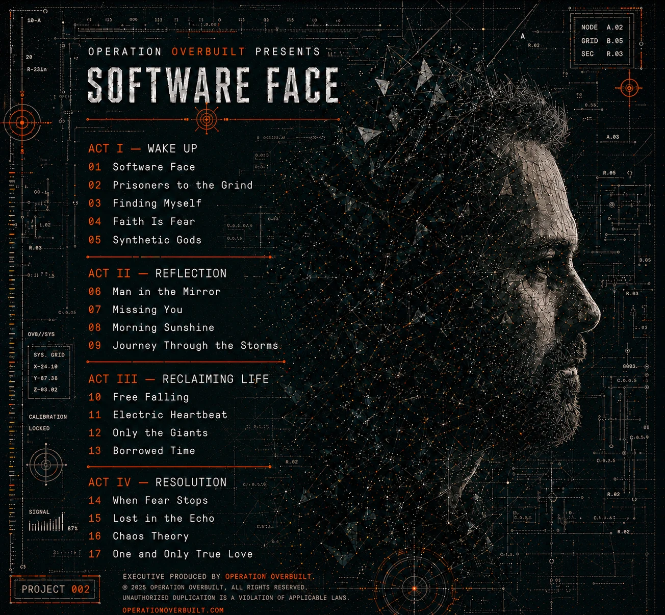
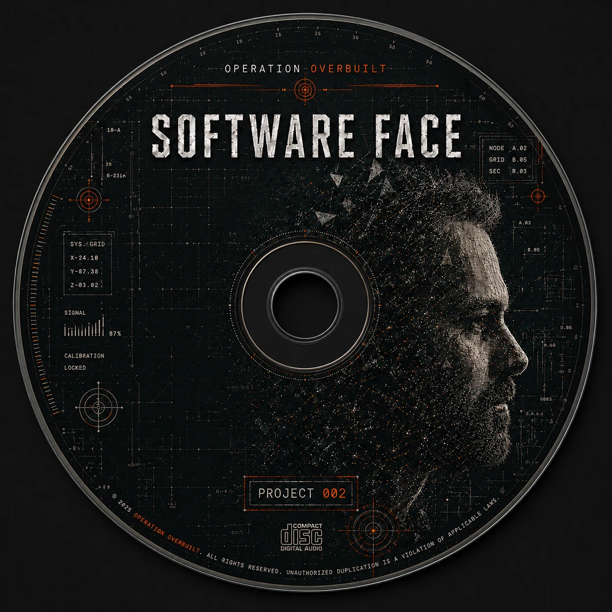
Visual Systems explores how a creative language can move across album artwork, media platforms, websites, games, posters, merchandise and campaign assets while remaining recognisable, adaptable and alive.
Some experiments focus on art direction. Some focus on interfaces. Others focus on the difficult job of making very different media feel related without making them look identical.
The asset matters. The system behind it matters more.